I love Stumbleupon. Often I find some really useful looking web sites, like Questia.
Questia is a virtual library, I had a quick browse in my subject areas and it seems to have a lot of material that is useful for my study. There is a cost to subscribe, about $100 US for 12 months access which doesn't seem too much.
I shall check it out some more and keep it in mind for next semester.
Another useful resource, Study Guides and Strategies by Joe Landsberger has a lot of material to benefit learning processes.
28 December 2007
14 December 2007
Google Earth to catch a killer?
Homicide detectives are hoping satellite images captured by Google Earth may provide some clues in the recent murder case of a woman in Victoria. More from News Limited.
11 December 2007
Labor's full-fee degree abolition
Australia went to the polls late last month and voted in the new Labor government, on a platform of industrial relations, climate change and educational reform. The wave of optimistic euphoria following the change of guard is levelling out somewhat as Labor put their plans into practice. The biggest change ahead for universities is of course the move to abolish full fee degrees for domestic students, in favour of more merit-awarded HECS places.
This would seem to fit in with the UQ's John Quiggin's view that all the FEE-HELP scheme did was lead to overcharging of students. There is a concern however about the hit universities would take financially, and some speculation about whether the government will provide extra funding to compensate.
While Education Minister Julia Gillard maintains that universities will be adequately compensated for the full-fee phase out, the forecast is that universities will be forced to make more places available for full-fee paying international students.
25 November 2007
NED12 Final assignment
We had to do a web site and a flash-based banner ad with animation and audio.
The web site - I had some really helpful feedback from tutor and class, was pretty happy with it (a bit over it at the moment, having been working on it solidly the last two/three weeks). A copy is published at www.mja.au.com

The flash banner ad was interesting. I am still trying to get the hang of layers, stages, frames and instances. For my first banner ad with audio it is a fair attempt I think!
20 November 2007
What the hcard
Thought I'd read up on this and include it with my assignment. Digital Web Magazine article - http://www.digital-web.com/articles/microformats_primer/
24ways.org article - http://24ways.org/2005/practical-microformats-with-hcard
24ways.org article - http://24ways.org/2005/practical-microformats-with-hcard
12 November 2007
Hold your position
Patrick Fitzgerald provides this concise yet well explained 10-step lesson in CSS Positioning. A good demonstration of the value of chunking for any sort of learning material. It managed to sink in through my thick head!
Also learned something about vertical centering from Bert Bos' tips on Centering Things. Unfortunately there was a browser compatibility issue with lists and the display: table-cell property, so I couldn't use it.
Also learned something about vertical centering from Bert Bos' tips on Centering Things. Unfortunately there was a browser compatibility issue with lists and the display: table-cell property, so I couldn't use it.
11 November 2007
Colorblind filter
Or if you're Australian like me - colourblind filter.
In NED12 assignment one, the marker commented that they wondered how the design would go with a red filter. I decided to test this on my final assignment, and found an online filter test at http://colorfilter.wickline.org/.
So far my design-in-progress has passed with flying colours (haha). I also tested my design from assignment one - my lovely Australian bush colours become quite drab, but at least it still seems to pass from an accessibility standpoint.
Rounded corners in photoshop
Was trying to get anti-aliased curves. This method works great - http://matthom.com/archive/2004/09/10/fast-rounded-corners-in-photoshop
6 November 2007
Pardon my plagiarism
It's not illegal, it is a simple question of ethics: an interesting look at the issue of plagiarism. The different attitudes towards students and academics; the tremendous resources used to ineffectually try to "catch" plagiarists; the injustices and the inpracticalities. Dale Spender argues that while cheating slips under the radar there is little logic in punishing students for using the words of others or as Benjamin Franklin put it, "standing on the shoulders of giants" in their learning process. Read more from smh.com.au
Socialising improves your memory
According to new research spending just 10 minutes talking to someone can help improve your memory and can also boost your performance in tests.
Researchers at the University of Michigan say they have found that socializing is just as effective as more traditional methods of mental exercise for boosting the memory and improving intellectual performance. Read more from News-Medical.Net.
Researchers at the University of Michigan say they have found that socializing is just as effective as more traditional methods of mental exercise for boosting the memory and improving intellectual performance. Read more from News-Medical.Net.
The value of an Arts degree
Interesting article by 18 year old Patrick Begley - Is the Arts degree history? To consider liberal arts studies to have little relevance in the modern workforce is to overlook the value of Arts in encouraging a variety of thinking skills. Read more from news.com.au
5 November 2007
Module 10: Audio Design
Putting audio on the web
Tutor Edwin provided link to free audio site he uses: http://freesound.iua.upf.edu/forum/index.php
Fellow student Daniel very helpfully provided link to some great software - http://www.nch.com.au/switch/index_b.html which really helped me with my banner ad part of the assignment!
Tutor Edwin provided link to free audio site he uses: http://freesound.iua.upf.edu/forum/index.php
Fellow student Daniel very helpfully provided link to some great software - http://www.nch.com.au/switch/index_b.html which really helped me with my banner ad part of the assignment!
Module 7: Animation Introduction
Find stuff about making animations - in Flash preferably. Found this tutorial on creating a photo fading slideshow from UC Berkeley, for Apple users.
Fellow student Tracy M found this ALA article by Drew McLellan on embedding flash while supporting web standards, Flash Satay.
Some CS3 basics from Adobe.
Fellow student Tracy M found this ALA article by Drew McLellan on embedding flash while supporting web standards, Flash Satay.
Some CS3 basics from Adobe.
Module 6: Project Management
Look for good resources about project management (particularly web site projects of course)
Module 5: Banner ad design
List some useful resources to effective banner ad design! (particularly flash animated ads).
Module 5: Information Architecture
This module is titled "information architecture" but half of it is about designing banner ads. Go figure!
There will be links here to resources about information architecture - site organisation, directory structure.
There will be links here to resources about information architecture - site organisation, directory structure.
26 October 2007
Module 4: Screen Design & Storyboards
Site elements:
* Web Style Guide - Planning, Lynch & Horton (2004)
* Text & Graphical layout based on principles by Robin Williams & John Tollet, Brian Josephson (2002)
* Screen Design Research, Bonnie Skaalid (1999)
* Writing for the Web: Elements of Effective Screen Design, Dr. Stuart Blythe (2001)
* Visual Literacy, Screen design, Betty Hennessy (n.d)
* Screen Design, keithpeterb on Youtube
* The Need for Web Design Standards, Jakob Nielsen (2004)
* Elements of style for web design, Christine A. Quinn (n.d)
* Principles and Elements of Design, Joshua David McClurg-Genevese (2006)
* Elements of Interface Design, Virginia Tech
* Design Rules, Anna Muoio and Lucy A. McCauley (1999)
* Elements of Design Applied to the Web, Kyle Meyer (2007)
* Elements of Web Design Today, Hyder Jaffari (2007)
Navigation:
Links - Navigation
* Basics of Navigation, Sean Timberlake (2000)
* Navigation, Joe Gillespie (2000)
* Basic Principles of Web Site Navigation, Charlie Morris (1999)
* Website Navigation, Ross Shannon (2007)
* Website navigation is useful, Adam Baker (2001)
* Where am I?, Derek Powazek (2006)
- Home pages - strategies include menu list of links, news-oriented front page, path-based split, splash screen - or a combination of these.
- Graphics or text - visual design versus usability/seo
- Master page layout grid - a standard layout for all pages, not dominated by homepage design
- Menus and subsites - grouping sections together into digestible chunks
- Resource lists, links to related sites
- Tables of contents, site maps, site indexes
- "What's New?" pages - for regular visitors
- Search features - for large sites
- FAQ pages
- Custom error pages
* Web Style Guide - Planning, Lynch & Horton (2004)
* Text & Graphical layout based on principles by Robin Williams & John Tollet, Brian Josephson (2002)
* Screen Design Research, Bonnie Skaalid (1999)
* Writing for the Web: Elements of Effective Screen Design, Dr. Stuart Blythe (2001)
* Visual Literacy, Screen design, Betty Hennessy (n.d)
* Screen Design, keithpeterb on Youtube
* The Need for Web Design Standards, Jakob Nielsen (2004)
* Elements of style for web design, Christine A. Quinn (n.d)
* Principles and Elements of Design, Joshua David McClurg-Genevese (2006)
* Elements of Interface Design, Virginia Tech
* Design Rules, Anna Muoio and Lucy A. McCauley (1999)
* Elements of Design Applied to the Web, Kyle Meyer (2007)
* Elements of Web Design Today, Hyder Jaffari (2007)
Navigation:
- All about organising information using logic, hierarchy to structure relationships
- Information best presented in short "chunks"
- Hierarchies ranked by importance, organised by interrelationships
- Logical/predictable organisation helps users know where to find things
- The "three click rule"
- Four navigational/site structures - sequences, hierarchies, grids, webs
Links - Navigation
* Basics of Navigation, Sean Timberlake (2000)
* Navigation, Joe Gillespie (2000)
* Basic Principles of Web Site Navigation, Charlie Morris (1999)
* Website Navigation, Ross Shannon (2007)
* Website navigation is useful, Adam Baker (2001)
* Where am I?, Derek Powazek (2006)
16 October 2007
NED12 Flash tutes
Let's learn about Flash and hopefully create a decent animated banner for my next NED12 assignment! Course work suggests going straight to the source to learn about Adobe Flash..
* W3C Schools suggests starting off with the lessons that are included with Flash the program
* Adobe's Using Flash for the First Time - 1. Building a banner. Perfect!
* W3C Schools suggests starting off with the lessons that are included with Flash the program
* Adobe's Using Flash for the First Time - 1. Building a banner. Perfect!
:-) Smiley turns 25
Twenty-five years ago, Carnegie Mellon University professor Scott E. Fahlman says, he was the first to use three keystrokes -- a colon followed by a hyphen and a parenthesis -- as a horizontal "smiley face" in a computer message.
Read more on CNN.com
Read more on CNN.com
NED12 Illusion of depth
Elements used to create the illusion of depth include perspective or scale - size decreases with distance, meaning things that are further away look smaller. Variation in line thickness can be used to suggest depth - for example the lines of a road or train tracks will get thinner as they get further away. Objects also overlap when one is in front of the other.
"Atmospheric perspective" objects in foreground in greater detail, brighter colour, deeper value than objects in background. Colours - we perceive warm colours as being closer than cool colours.
* Andrew Kator - Quick Tips in Design - Part 3: The illusion of depth
* Brian Stonehill's Principles of Visual Literacy - Scale used to create illusion of depth
* Jacci Howard Bear - Using drop shadow to create dimension
* Western Illinois University - Elements and Principles of Design: Depth
NED12 Positive and negative spaces
I was just learning about this in the drawing class I've started. Positive space is the area occupied by our subject. Negative space is the surrounding area or background space. The frame or drawing space makes up the third element of composition.
Looking deeper we realise that negative and positive spaces can develop an interdependence. Enough negative space (aka whitespace) around an object can draw attention to that object and give it priority.
A good composition is generally thought to have a balance of negative and positive space (although this can vary according to purpose). Artists like M. C. Escher play with reversal of negative and positive spaces to create complex illusions (Jirousek, C. Form, Shape and Space).
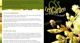
Web designs, such as many of those displayed on CSS Zen Garden use the interplay of positive and negative space to create depth to a design, which compels the eye to move around the page.
* Digital Web - Principle of Design
* Web Design Office - Negative Space
* Apogee Photo Magazine - Primer on positive and negative space
* Jim Saw's Design Notes
Looking deeper we realise that negative and positive spaces can develop an interdependence. Enough negative space (aka whitespace) around an object can draw attention to that object and give it priority.
A good composition is generally thought to have a balance of negative and positive space (although this can vary according to purpose). Artists like M. C. Escher play with reversal of negative and positive spaces to create complex illusions (Jirousek, C. Form, Shape and Space).
Web designs, such as many of those displayed on CSS Zen Garden use the interplay of positive and negative space to create depth to a design, which compels the eye to move around the page.
* Digital Web - Principle of Design
* Web Design Office - Negative Space
* Apogee Photo Magazine - Primer on positive and negative space
* Jim Saw's Design Notes
15 October 2007
NED12 Visual hierarchy
The arrangement of elements according to importance and emphasis.
* Lynch and Horton's Web Style Guide - Visual Hierarchy
* Luke Wroblewski - Visible Narratives: Understanding visual organisation
* Tutorial Outpost - Get Some hierarchy in Your Design
* Lynch and Horton's Web Style Guide - Visual Hierarchy
* Luke Wroblewski - Visible Narratives: Understanding visual organisation
* Tutorial Outpost - Get Some hierarchy in Your Design
NED12 Flowcharting and wireframes
Smashing Magazine
* 30 Usability Issues to be Aware of
* Designing with a Grid Approach
Digital Web Magazine
* Prototyping with Style
* Just Build It: HTML Prototyping and Agile Development
* Getting IA Done
* Return on Design (review of Ani Phyo's book)
A List Apart
* Avoid Edge Cases by Designing Up Front
* Paper Prototyping
Site Point
* Breaking Out of the Box
* Process and Documentation
.net Magazine
* Designing with Patterns
List of resources from WebsiteTips.com
NED12 Rhythm and flow
Rhythm is a pattern created by repeating or varying elements, with consideration given to the space between them, to create an effective ebb and flow which visually leads the eye from one element to another.
From WikiBooks:
From WikiBooks:
..human beings are more comfortable with variation in general. Psychologically, most any serious lack in variation of anything (a solid, a line, a sound, a situation) can become very boring. Adding a little variation at non-specific intervals (every now and again) gives most any design an interesting appeal as long as it is not overdone.
If rhythm is overdone it can be disruptive and create a counter-dynamic.
13 October 2007
Texting, Facebook Used to Alert Students
Trying to make up my mind whether this is a cool adoption by educators of modern technology, or a sad indictment on the gun situation in the US - students are being alerted to the presence of armed and dangerous on campus via text, email and facebook adverts. Read more.
Agents losing student dollar to web
Interesting piece by Milanda Rout from AustralianIT, the increasing role of social networking sites like Facebook and Myspace in recruiting overseas students to universities. Read more.
9 October 2007
NED12 Stripey backgrounds in Photoshop
I had a lot of fun with my first NED12 assignment, and in the course of working on it greatly improved my knowledge and confidence in Photoshop. This photo by Georgie Sharp of a bee hovering over the wattle really took my fancy, and the stylised text above it is intended to be reminiscent of the bee's flight path. The stripey background was a simple technique I learned about from blogger Amy on Shooting the Kids.
More reading: Elements of great Web design: The polish

More reading: Elements of great Web design: The polish
7 October 2007
NED12 Texture
"Texture is created by varying the pattern of light and dark areas on an object." Elements of Design: Contrast from Bonnie Skaalid, 1999.
Five Texture Tips from Photoshop Tips & Tricks
Five Texture Tips from Photoshop Tips & Tricks
3 October 2007
NED12 Contrast
Something I've picked up from my reading about contrast - that it is not just about colour, but can be contrast in size, style or other aspects of objects.
As I was doing the NED12 exercise of selecting example web sites of high and low contrast, I was looking specifically at colour. The writer at Webreference.com reckons "this sort of contrast is too straightforward and even boring to be useful."
All Graphic Design has listed some other great resources about contrast.
Some simple examples of how contrasting elements are used for web page design to make it stand out and show what is important - Basic Web Page Layout & Design, University of Albany Libraries (2002)
1 October 2007
Rising cost of higher education in Australia
An article from The Age highlights the recent OECD report, which states that Australia has the fourth most expensive degrees in the developed world after the US, Japan and Korea.
There was hope on the horizon some months ago with opposition leader Kevin Rudd's pledge to do "something" about the massive debt shouldered by students; but policy details are lacking and it appears the issue is on the political backburner.
Increasing costs and reduced government funding do not yet appear to have deterred students, and the proportion of university students from disadvantaged socio-economic backgrounds remains steady - but there is argument that the actual effects will take some time to make themselves known.
"University participation direct from school is dropping, particularly among country students, who say they are deferring because of the cost." (Adam Morton, The Age)
1. HECS-HELP for eligible Commonwealth supported students;
2. FEE-HELP for eligible full-fee paying students; and
3. OS-HELP for eligible Commonwealth supported students who want to study overseas.
There was hope on the horizon some months ago with opposition leader Kevin Rudd's pledge to do "something" about the massive debt shouldered by students; but policy details are lacking and it appears the issue is on the political backburner.
Increasing costs and reduced government funding do not yet appear to have deterred students, and the proportion of university students from disadvantaged socio-economic backgrounds remains steady - but there is argument that the actual effects will take some time to make themselves known.
"University participation direct from school is dropping, particularly among country students, who say they are deferring because of the cost." (Adam Morton, The Age)
Govt schemes in last 30+ yearsThere are presently three types of university debt HELP schemes:
1974 Gough Whitlam abolishes university tuition fees, arguing higher education is a public good that should be free for all.
1989 John Dawkins, education minister in the Hawke government, introduces the Higher Education Contribution Scheme — a deferred loan system with fees drawn from wages once income passes $22,000. Original flat-fee rate of $1800 a year. The most expensive degree, medicine, costs $10,800.
1997 Howard Government introduces differential HECS. Students pay between $3300 and $5500, depending on their degree. Income threshold lifted from $25,000 to $35,000. Medicine costs $33,000.
1998 Introduction of full-fee places for Australian students.
2005 HECS rates lifted by 25 per cent. Maximum rate of $8018 a year. Medicine costs about $50,000.
2007 Cap lifted on how many full-fee places universities can offer. Full-fee degrees cost up to $250,000.
1. HECS-HELP for eligible Commonwealth supported students;
2. FEE-HELP for eligible full-fee paying students; and
3. OS-HELP for eligible Commonwealth supported students who want to study overseas.
More info www.goingtouni.gov.au.
25 September 2007
NED12 A design process revealed
A fellow student Tracy found this article by Douglas Bowman, A Design Process Revealed, very relevant to our first assessment task. It relates the processes behind designing a CSS Zen Garden submission. It is heartening to be told that no great artistic talent is necessary; design is a systematic process which can be grouped into phases as follows:
* research and discovery
* competitive analysis
* exploration
* thumbnail sketching
* typography
* imagery
* composition
* execution and implementation
* review
* research and discovery
* competitive analysis
* exploration
* thumbnail sketching
* typography
* imagery
* composition
* execution and implementation
* review
24 September 2007
NED12 Photoshop exercises
The "practice" exercises in Module 2 are driving me crazy! it is not that they are simple, or boring and repetitive; it is the vague and confusing wording of the task descriptions. I'm not alone in this, several of the other students have been having difficulty interpreting what is required from the task.
A lot of us are still learning to use Photoshop, some good links shared on the forum - del.icio.us/hamjak/photoshop. Thank goodness design is more than learning Photoshop.
Update 29/09 - Kathleen found a really good resource in Janee's Photoshop Tutorials. I am working my way through them and find them easy to follow, with good exercises to help remember things like shortcut keys etc. I have always been so confused by layers and paths, this set of lessons is making it a lot clearer.
18 September 2007
No more paid content NY Times
Since starting at Uni my research efforts have been thwarted a few times by subscription-only content on the Web. Amongst the various publications, NY Times articles have appeared in search results looking very interesting and relevant, but would only take me as far as a login page.
So it is rather good news that NY Times have decided to do away with online subscriptions. This follows a review of their business model which showed that the potential ad revenue generated by traffic from search engines was greater than the revenue from paid subscriptions.
Read all about it on NY Times - Times to End Charges on Web Site
16 September 2007
NED12 Visual weight
Visual weight an illusion of physical weight, such as with bold face type.
Balance where visual weight appears to be equally dispersed throughout the design.
- Symmetrical balance: mirrored distribution on either side of an imaginary vertical access
- Asymetrical balance: the arrangement of unequally weighted elements in a design.
Further reading:
* Visible Narratives: Understanding Visual Organization by Luke Wroblewski
* Composition and Design Principles by Marvin Bartel
* The Principles of Design by Joshua David McClurg-Genevese
15 September 2007
NED12 Designing a unified interface
Another important element of design - unity. Coherence, usability, better communication. Psychological studies have shown that users want to see unity, if they don't see this they lose interest.
Unified design needs a consistent visual style throughout the document/site. Visual devices include visual style, alignment, balance, flow, and a grid.
Creating unity with visual style:
* Use similar colors
* Use similar shapes
* Use similar line weights
* Use similar typography
* Use similar photographs
* Use similar illustration styles
* Use same artist for all graphics
* Repeat the elements above you use throughout your site
Further reading:
Some examples of unified design through repetition, proximity, continuation.
Unity - Basic principles of design, from About.com
NED12 Alignment and the grid
Elements that are lined up with each other share a visual connection that can enhance design and increase usability and legibility. Consistency, predictability are essential elements to any well designed information system.
Grids are commonly used in design (and I've heard the term bandied about a lot!) to help with alignment. A good grid design is a flexible one - it can have as many or few grids as desired, and there will be times when breaking out of the grid is appropriate. The goal when working with a grid for web design is to create a consistent layout that allows you to plug in text/graphics, without having to rethink the design approach on each page. (Lynch & Horton 2001)
A new term introduced here - registration, in reference to precise alignment, positioning of elements down to the last pixel.
Further reading:
* Why use a grid? Mark Boulton
* Grid systems for the Web Part 1, Part 2 Fixed, Part 3 Fluid, Mark Boulton
* Grids are good [PDF] excellent presentation by Khoi Vinh and Mark Boulton
* Smashing Magazine's Designing with grid-based approach lists references and resources
* Designing grid-based blog template, Michael Angeles
* Design By Grid articles, tutorials and resources
NED12 Getting colours right on the screen
Gamma correction - generally what looks good on a Mac, appears too dark on a PC and conversely, images created on a PC often look light and washed out on a Mac. Gamma is set by adjusting a numerical value - Macs have a default gamma setting of 1.8; on PCs the default is around 2.5 (but there are many variables). W3C has set a Web standard to 2.2 for all platforms (also suggested by CGSD back in 1998), creating an easy medium.
I followed the steps listed in Joe Gillespie's article on Palettes to make a gamma correction on my PC. The first thing that happened was everything got a lot brighter and I could distinguish darker shades a lot better. My browns don't look so red now, either.
Did you know the word "pixel" was created from picture element? Lynch and Horton mention this in an explanation of bit colour display.
My own display is set to 32-bit colour, but I discovered that it actually has the same number of colours as 24-bit display, the extra byte is for an alpha channel which optimises memory - 'The only reason this is done is that on the Intel 32-bit PCI/AGP/Memory data bus its more efficient to get at data that is "32-bit aligned". [with 24-bit data you often actually have to read the pixel's data twice--and then mask for the bits you are interested in]' (John Schilling, Scala, 2002)
9 September 2007
Using your noggin
Another link courtesy of my sister, Luciano Passuelo's new site LiteMind is all about exploring ways to use our minds efficiently. My favourite articles would have to be How to Recall an Entire Book in 5 Minutes or Less and What is Mind Mapping? (and How to Get Started Immediately) since both of these things are pretty good to have a handle on for uni.
Luciano is a fan of famous quotes also, and has convinced me it is not just idle entertainment.
Luciano is a fan of famous quotes also, and has convinced me it is not just idle entertainment.
Instinctive reasoning
I get a daily quote on my Google start page each morning. This one today by Bertrand Russell is profound:
If a man is offered a fact which goes against his instincts, he will scrutinize it closely, and unless the evidence is overwhelming, he will refuse to believe it. If, on the other hand, he is offered something which affords a reason for acting in accordance to his instincts, he will accept it even on the slightest evidence. The origin of myths is explained in this way.Of course, underneath this quote (I get two a day) was a gem from Walt Disney:
I love Mickey Mouse more than any woman I've ever known.
8 September 2007
NED12 Colour theory
Some reading to get through this weekend:
Digital Color Wheel
Colors on the Web
Color Theory
Colour schemes created via the colour wheel:
Some terms to remember:
Types of colour:
Effective colour combinations:
A school of thought believes the most effective combination is red, black and white, but the commonly used rule is to use three colours - a main colour, a similar secondary colour and a contrasting highlight.
Digital Color Wheel
Colors on the Web
Color Theory
Colour schemes created via the colour wheel:
- Analogous - colours next to each other on the wheel, match well, no contrast - serenity, comfort.
- Complementary - colours directly opposite each other on the wheel - high contrast, vivid, stand out.
- Split complementary - combination of a colour with the analogous colours of its complementary on the wheel.
- Triad - three colours located at equal distance from each other on the wheel.
- Tetrad - four colours found at each corner of a rectangle or square placed on the colour wheel.
- Diad - two colours that are two colours apart on the wheel
Some terms to remember:
- Hue - another name for colour!
- Tint - a light colour created by mixing with white
- Shade - a dark colour created by mixing with black
- Value - increases according to the amount of black
- Saturation - the level of colour - full colour = vibrant
Types of colour:
- RGB - red green blue; additive colour scheme, uses the absence/presence of light to create colours, primary colours combine to create white.
- CMYK - cyan magenta yellow black; subtractive colour scheme, uses the absence/presence of pigment to reflect or absorb light, primary colours combine in equal amounts to create the appearance of black.
Effective colour combinations:
A school of thought believes the most effective combination is red, black and white, but the commonly used rule is to use three colours - a main colour, a similar secondary colour and a contrasting highlight.
2 September 2007
Thinking like a genius
Since introducing my sister to StumbleUpon she has been finding all these cool sites and sending them to me. She thought my studies could use a bit of help and guidance and sent me this link to Thinking like a Genius. It's all about thinking productively and creatively rather than reproductively, something they taught us in REA11.
I also found this resource on Critical thinking on the Web (all by myself!) which looks pretty good - lots of links and quotes and references there.
I also found this resource on Critical thinking on the Web (all by myself!) which looks pretty good - lots of links and quotes and references there.
30 August 2007
NED12 Usability
An important aspect of good graphic design is creating an interface that is visually appealing and intuitive - interesting to use without having to think too hard about it. It's all about the audience:
There is quite a difference in opinion in how usability and graphic design are intertwined on the web, as discussed in Usability Experts are from Mars, Graphic Designers are from Venus and Usability is not Graphic Design. The web site of well known usability expert Jacob Nielsen is described by the University of Greenwich as "inelegant".
Graphic design creates visual logic and seeks an optimal balance between visual sensation and graphic information. Without the visual impact of shape, color, and contrast, pages are graphically uninteresting and will not motivate the viewer.
Visual and functional continuity in your Web site organization, graphic design, and typography are essential to convince your audience that your Web site offers them timely, accurate, and useful information. A careful, systematic approach to page design can simplify navigation, reduce user errors, and make it easier for readers to take advantage of the information and features of the site. (Lynch & Horton 2001)
There is quite a difference in opinion in how usability and graphic design are intertwined on the web, as discussed in Usability Experts are from Mars, Graphic Designers are from Venus and Usability is not Graphic Design. The web site of well known usability expert Jacob Nielsen is described by the University of Greenwich as "inelegant".
Some of the ways graphic design support usability, a walk through arranging information and analyzing graphic design.
Some interesting comments by Anne Harris in Building for Usability. She suggests instead of creating a plain vanilla looking site by building down to the lowest common denominator, we aim high and build in the ability to scale down. Makes sense.
29 August 2007
NED12 How to critique
After the process of experimentation it is a good idea to critique, or evaluate your work - it forces you to view your work objectively and assess how well it meets the project objectives.
Robin Landa provides the following checklist to refer to when evaluating your design solutions:
Part I: The Project
Part II: The Process
Robin Landa provides the following checklist to refer to when evaluating your design solutions:
Part I: The Project
- Restate the goal or aim of the project – in your OWN words. Do this to make sure you understand the problem you are setting out to solve.
- Did you fulfill the goal you were supposed to achieve? Did you miss the point of the original problem you were trying to solve?
- Is your solution appropriate for the audience or purpose of the project you are working on? For example, are your colors childish or corporate?
- Is your solution appropriately executed?
- Are you using a suitable visual hierarchy of information? Will your audience know where to look first, second, and third?
- Does your solution communicate the intended message to your audience appropriately? You can ask people to tell you what message they are interpreting from your design.
Part II: The Process
- Did you do any research? If so, how did you use it? Should you have done more?
- How many thumbnail sketches and roughs did you do before you created your comp? How much time did you really think about the problem?
- Did you experiment outside of your comfort zone? Or did you stick to your area of strength?
- Did you make any false assumptions about what you could or couldn't do? Or did you take a positive approach that you could do anything if you really tried? It is very important to experiment and build your confidence in designing. Try flipping, stretching, skewing, speckling, etc
- Did you really allow yourself to become involved in this problem you were solving? Did you use your imagination and feelings? Were your feelings personal or removed?
- Were you too judgmental? Did you give yourself a chance to be creative? Were you patient with the project and yourself? Don't be so hard on yourself that it makes you afraid to take chances.
- Did you take chances? Were your solutions innovative? Did you dare to be different? Or did you do what most people would do? One way of determining this is to compare your solution to others? How many other people reached the same conclusions?
For critique exercise, some inspiring designs:
www.patagonia.com (DI) - a simple, clean looking interface with lovely huge wildlife or landscape photographs, lots of white space giving an impression of space, simplicity. Browsing the navigation bar there is quite a lot of information available on the site, but it is cleverly designed so as not to confuse or overpower the visitor.
spanish-portuguese.berkeley.edu (DI) - another clean, clear look. I love the typography on this one. There is a LOT of text, but it has been presented in a decorative way so as not to be overpowering or boring.
www.crocs.com (DI) - This is a very bright and funky interface, which I think says a lot about the product - it is fun, colourful fashion. At the same time it is clean and simple, easy to navigate - allowing focus on the product.
And some poor designs (featured on webpagesthatsuck.com):
www.westservicecenter.com
www.redbloodclub.net
meteo.previsionsfrance.org
Basic principles of design from Digital Web, a Flash site to check out www.thefwa.com (courtesy Jo J.)
28 August 2007
NED12 Graphic design basics
Well it's week one in a new study period and I'm looking forward to the fresh start, although I had some initial apprehensions about this unit because design has never been one of my strengths. Hopefully the theory we cover here will give me more confidence.
In the first reading we are told that to learn to design, we must think like a designer. This involves problem solving, asking questions, research and experimentation. So it's not just about making things look pretty!
Some points on experimentation and turning doodles into designs:
In the first reading we are told that to learn to design, we must think like a designer. This involves problem solving, asking questions, research and experimentation. So it's not just about making things look pretty!
Some points on experimentation and turning doodles into designs:
- Think with your mouse or pencil in your hand. Doodle until you've found some interesting visuals. Then try sketching them into small thumbnail sized drawings. It may seem frustrating at first, but you can't just think about how you are going to design something. You have to experiment with a range of ideas – and not just go with the first one that pops into your head.
- Choose three of your best thumbnail sketches and turn them into roughs. Roughs are sketches that are larger and more refined than thumbnails. They help you visualize your ideas more realistically. If you use tracing paper, you can combine your sketches to create interesting composites that might solve your design problem. If your sketches aren't working out, go back to develop others from your collection of thumbnails. Once you are satisfied with some sketches, don't hesitate to wait a day or so before moving to the next step.
- Choose your best rough and turn it into a comp, mock-up, or prototype. A comp, mock-up, or prototype should look like the real thing. It should look extremely clean and accurate.
(Landa 1996)
27 August 2007
NET12 Dropout
In a previous post I described how I barely managed to hand in my second NET12 assignment. Things steadily degenerated from there, and by the final week I was way behind and hadn't even started assignment three. I just hit a wall halfway through the study period, and it was all I could do to complete NED11. It's disappointing, but I just have to get over it and move on. I'll give NET12 another try next year. Geez I hope I pass NED11!
22 August 2007
UNE to act on spate of plagiarism
A report on VillageVoice.com.au (22 Aug, 2007) that the University of New England in NSW has detected a spate of plagiarism amongst theses submitted over the last few years for an IT masters program, and the students involved could be stripped of their degrees.
Notably the theses were all written by international students. Although the report doesn't state where the students come from it is apparent there are cross-cultural factors involved. A search on Google reveals there is much comment on the issue of cross-cultural plagiarism, and it is also the subject of several academic studies.
The report states the students were part of a program run by a commercial partner of UNE. I would hope as well as making a fair decision on what action is taken against the students, that UNE also considers the role and actions of its commercial partner in making students aware of the issue.
18 August 2007
Nearing the end of SP2
Fellow student Kathleen sent me a sticky note on Facebook - "Hang in there - SP2 is nearly over!". Very welcome words, this has been the shakiest SP for me since my first enrolment. I really don't know how they do it, these other students who take on four subjects at once. I took only two, but after this SP I'm going back to doing one at a time.
5 August 2007
CafeScribe - textbooks 2.0
This is a new service that has a lot of potential, although there is not a lot of content available at the moment I can see CafeScribe really taking off as perhaps another Facebook, its focus on students.

It offers e-book versions of university textbooks for download, at reportedly half the usual print price, providing the opportunity to save some money as well as a few trees. Students can also upload their own PDF documents and share notes, add "friends" to their profile and join student discussion groups.
This sharing of notes and documents might raise some issues about collaboration, or breach of copyright if students are sharing published texts. The service does address the latter issue in its Terms of Use but it is yet to be seen how this would be enforced. There have been a few similar sites offering "textbook sharing" which seem to cross the line, but as one author/lecturer remarked, for small time publishers it's probably not worth the cost of legal remedy.
External links:
- E-book site for students promises to save trees, money Sabena Suri, CNet Aug 2007
- Post by Kristen Nicole on Mashable, Aug 2007
4 August 2007
NET12 Second Assignment
I completely fangled this one. We had to create an anno-bib using six or more resources for the question we wish to do in assignment three. I left it too late and although I found some good resources, I didn't allow myself enough time to read and assess them. I managed to write at least a brief comment for each one (far short of the required 100 words). Worth 10 marks. Oh well.
As fellow student Spike said with the last assignment - you get what you put into it. Not much in this case!
As fellow student Spike said with the last assignment - you get what you put into it. Not much in this case!
NED11 Second Assignment
Results back for first assignment - 80%. Tutor comments:
Good point. I have a few strategies to address "skinny" content panels.. but with precise positioning on this site it might be a struggle.
Poor tutor was ill, and our results were delayed. Very kindly gave us an extra week to complete our next assignment, which is very good news for me! I've been able to tackle it at a more leisurely pace and incorporate a little more research.

From wireframe document to design prototype. The subject is fictional, and the choice of colours from a randomly chosen palette at Adobe's Kuler site. Sort of McDonald-ish?

It really is a rather old fashioned layout, next time will aim for something more Web 2.0-ish and make use of ae larger display size.
Hi Melissa, you could prolly have a go at doing a 1028 x 768 site these days. I wonder whether 800 wide will look a bit lonely on some widescreen monitors as that seems to be what's happening with many of my older sites. Excellent use of breadcrumb navigation. Clear and consistent navigation. Very nicely researched. Great work! Plus I really liked your layout.
Good point. I have a few strategies to address "skinny" content panels.. but with precise positioning on this site it might be a struggle.
Poor tutor was ill, and our results were delayed. Very kindly gave us an extra week to complete our next assignment, which is very good news for me! I've been able to tackle it at a more leisurely pace and incorporate a little more research.

From wireframe document to design prototype. The subject is fictional, and the choice of colours from a randomly chosen palette at Adobe's Kuler site. Sort of McDonald-ish?

It really is a rather old fashioned layout, next time will aim for something more Web 2.0-ish and make use of ae larger display size.
30 July 2007
NET12 Bank tellers and technology
One of our NET12 unit readings is the Langdon Winner paper Who will we be in Cyberspace? which expresses reservations on the changes wrought on society as new forms of technology are adopted. He specifically mentions traditional roles such as bank teller and teacher disappearing, which made me recall the changes I’d observed during my time in the banking industry.
I posted this story in the student discussion area, and thought I would put it here too.
I worked for one of the “big four” banks for several years from the late ‘80s and through the ‘90s, so I was fortunate to see what it was like before and after the old mainframe terminals and paper reports were replaced with PCs and GUI, before and after telephone banking and internet banking came into existence. By that time ATMs had been around for a few years, and I recall an old highschool teacher of mine steadfastly refused to use ATMs because, sharing Winner’s fears, he declared it put bank tellers out of jobs!
The first PCs in bank branches appeared in the managerial departments, and it was the death knell as far as the managerial staff were concerned. The traditional role of bank manager, who knew everything about their customers and made important credit decisions based on their local knowledge, faded out of existence as the content of customer files became digitised and decisions became centralised.
A new breed of bank manager emerged, the locally respected financial authoritarian was replaced by an anonymous salesperson who, with a swathe of new financial products (thanks to various legislative changes) had high sales targets and high expectations of the branch staff.
The branch staff were transformed from the operational role of performing the bank’s functions, to a primarily sales role. Tellers were expected to flog products as they counted coin. Where monthly sales targets were consistently not met, decisions were made about the viability of keeping the branch open. The local bank branch was transformed from an institution to a MacDonald’s franchise – a “fast-finance” outlet. Staffers who didn’t like the new sales regime of the branches looked to the new operations centres, or left the bank altogether.
I was one of those who moved into an operations centre. These were shrinking too, they began as regional centres, by the time I worked in one it was a single state centre based in each capital city. By the time I left the bank, the state centre was about to be further rationalised into a national centre based in Melbourne, the number of bank branches had been severely reduced and uptake by customers of phone and internet banking was huge.
Some time after leaving the bank I switched my accounts to one of the community based banks that have sprung up in recent years. These seem to be filling the void left by the closure of the other bank branches. Even so, it is pretty rare that I venture into my local branch. I much prefer the convenience of internet banking, when I think of “bank” these days I tend to picture a web site rather than a building! I sometimes think about my old highschool teacher who hated ATMs, and wonder what his take on all the changes might be.
26 July 2007
NET12 Informing ourselves to death
Amidst acclamations of the wonders of the computing age, an academic named Neil Postman gave a lecture in 1990 to a group of Stuttgart computer scientists about the pitfalls of computers. Computers, he says are about information. And no amount of information causes or prevents things from happening to us.
The problem, says Postman is the message all this information leads us to believe. That all the information, and management of information will lead to a solution to our problems.
He finishes off with some sage quotes from philosophers, and summarises:
An interesting point of view, you get tired of hearing about the miracle of computers and the information age. Although, I do wonder what reception this paper received at that Stuttgart conference.
Postman’s paper at eff.org
The computer is, in a sense, a magnificent toy that distracts us from facing what we most needed to confront – spiritual emptiness, knowledge of ourselves, usable conceptions of the past and future.
The problem, says Postman is the message all this information leads us to believe. That all the information, and management of information will lead to a solution to our problems.
Imagine what might be accomplished if this talent and energy were turned to philosophy, to theology, to the arts, to imaginative literature or to education? Who knows what we could learn from such people – perhaps why there are wars, and hunger, and homelessness and mental illness and anger.
He finishes off with some sage quotes from philosophers, and summarises:
It is all the same: There is no escaping from ourselves. The human dilemma is as it has always been, and we solve nothing fundamental by cloaking ourselves in technological glory.
An interesting point of view, you get tired of hearing about the miracle of computers and the information age. Although, I do wonder what reception this paper received at that Stuttgart conference.
Postman’s paper at eff.org
NET12 Some play, some pay
I’m no gamer so this seems incredible to me, but there is a demand for people to play multiplayer online role-playing games on behalf of others who don’t have the time. The idea is to build status and “experience points” for their game character without the hard slog, by paying someone else to do it.
The Gamer Revolution documentary profiles a busy mother who outsourced her game character to a company in Rumania. She chose the level she wanted to be at, paid her money, and the company logged into her account and played the game around the clock to build up her character’s experience level.
It’s called “power-levelling” and one of the comments from the doco is that it is creating a new time economy for poorer countries to capitalise on the faster-paced lifestyles of Western societies. However it creates certain issues with the gaming companies, who say the practice is a security risk and against their terms of service; and the other players themselves, who view it as a weak move on the part of the player who pays someone else to “level” their character.
In the end, isn’t playing games all about having fun? these people are taking it wa-aay too seriously.
External links
- Gamer Revolution Youtube Clip (thanks to Helen in my NET12 class)
- Outsourcing your 'Warcraft' skills, Feb 2007 article on CNet
- Blog entry on The power-levelling industry by game design Raph Koster
- Wikipedia entry on experience points and power levelling
- Gamer Revolution page on ABC TV site
- ABC Message Board discussion about the documentary
10 July 2007
NED11 Fun with Gliffy
Gliffy is an online diagramming tool, I thought I'd give it a try for the flowchart in my web site design document. You can sign up for a free account, which allows you to store up to five diagrams and you can print or export them (with Gliffy logo).It was really easy to use, although it helped to have ideas down on paper beforehand. In this web site flowchart I've shown page hierarchy levels, and used colour to group the pages according to purpose. The hardest part was showing the navigation. The sub-level pages can only be reached via their parent page, but they allow navigation to the upper levels. See I can't even explain it well. Maybe I'm just thinking too hard about it.
5 July 2007
NED11 First Assignment
...is due next Friday the 13th. Hope this isn't an omen!
We have to prepare a blueprint document containing a "comprehensive analysis and visual depiction of a World Wide Web site". I've created a few web sites over the years but this level of planning is novel for me - now I know where I've been going wrong all this time!
We base the web site on a topic of our own choosing. I've been mulling over this and it is a toss up between re-creating the old "Bunch of Leunig" site I did way back in 1997 (about cartoonist Michael Leunig), or creating a site for the local Chamber of Commerce group (who have asked me to do one for them anyway).
UPDATE: Well I finished and handed it in on time! My topic ended up as a combination of the two - based on a Chamber of Commerce web site from the fictional town of "Curly Flat" (borrowed from Leunig).
The toughest part was trying to work out the best way to create the darn wireframes. I have Illustrator, I just don't know how to use it yet! haven't had time to play around with it. I ended up creating the wireframe in HTML with Dreamweaver, after reading Julie Stanford's article on the subject. I did a quick tables based layout, which served the purpose of this assignment. For my later assignment I shall have to recreate the site in a divs based layout (without Dreamweaver - we aren't allowed to use it).
24 June 2007
NET12 First assignment
A pleasant surprise this morning when I started pulling materials together for my essay. The due date is actually Mon 2nd July, not 29 June as I've been thinking. I'm not sure why I had the date wrong, but it is nice to realise I have a couple extra more days than I thought.
My copy of Weaving the Web by Tim Berners Lee arrived last week. Haven't had time to start reading it yet, but had a quick scan. It looks set to become another one of my favourites.
Dropped into the local library the other day and re-borrowed the John Naughton book, Brief History of the Future. The first time I read this book was not for any particular study requirements, it was just out of interest and I could not put the book down!.
As it turns out, I am not required to do extra research outside the supplied unit materials for this essay, so if I am pressed for time I shall probably not reference Naughton.
UPDATE 4 July 2007: Well it was done and handed in on time, after much thought and a change of tack. I decided to support the opposing view, with a major BUT..
Here it is: Internet a product of the U.S. military? [PDF]
I didn't reference Naughton - space was the issue, but some useful material was sourced from DARPA itself. It is interesting that despite being so heavily involved early on, DARPA is quite matter of fact about the Internet - it's like "yeah, we did it, so what.. we've done all this other cool stuff too..".
15 June 2007
NET12 Additional reading
YES! I managed to find an inexpensive second hand copy of Tim Berner-Lee's Weaving the Web on eBay!
I would also love to find John Naughton's Brief History of the Future but not having much luck. Shall nip down to the local library to see if I can borrow it again.
I would also love to find John Naughton's Brief History of the Future but not having much luck. Shall nip down to the local library to see if I can borrow it again.
7 June 2007
NET12 Technology & Politics
Langdon Winner. " Do Artifacts Have Politics?" The Whale and the Reactor: A Search for Limits in an Age of High Technology. (Chicago: The University of Chicago Press, 1986.) pp. 19-39
"The things we call technologies are ways of building order in our world."
- (Mumford) two types of technologies: one authoritarian, the other democratic
- structuring decisions are made either consciously or unconsciously, deliberately or inadvertently
- different people are situated differently and possess unequal levels of power/awareness
- choices quickly become firmly fixed in material equipment, economic investment, social habit
Some light reading: Who Woulda Thought. Famous last quotes about technology!
6 June 2007
Looking at SP3
SP2 has just started but I've been looking at the units available for next SP. I'm thinking of taking these two from Curtin:
NET23 The Internet: Policy, Regulation and Governance
NED12 Internet Design - Advanced
I suppose I should also register with Curtin for this degree, it is recommended by the third or fourth unit, which I am studying now.
UPDATE 6 July: I've decided to take just one unit next SP and have enrolled in NED12. None of my level 1 NET units are available in SP4 so shall look at a VIS unit later this year.
5 June 2007
Week two of studies
Two subjects, and I seem to be ploughing ahead through one and falling behind in the other!
NET12 I'm having difficulty with, due to some kind of performance anxiety I think! There is a requirement to participate in online discussions which isn't normally a problem, but it's been specified that for each topic there must be at least two posts - one has to be a substantial answer to one of the discussion questions (150 words minimum).
It is not difficult to respond to other people's posts, but it is difficult to construct two or three paragraphs with coherent and relevant thoughts on every single topic of the unit. I'm worried about being left behind.
NED11 has been pretty easy so far. I'm looking forward to getting my teeth into some of the meatier parts. I'm wondering what to do for my project web site. The local Chamber of Commerce asked me to put forward a proposal for a Web site, perhaps I might turn it into my project.
REA11 Results
Results in today, couldn't be happier.. 84 (HD).
My marks dipped in both assessments where I had to produce an analytical structure document, but picked up in narrative forms. Earlier I credited the analytical structure exercises with improving my essay structure. Go figure!
My marks dipped in both assessments where I had to produce an analytical structure document, but picked up in narrative forms. Earlier I credited the analytical structure exercises with improving my essay structure. Go figure!
4 June 2007
NED11 Module 1

Hobbes' Internet Timeline - http://www.zakon.org/robert/internet/timeline/
We have to select 5 milestones most relevant to the World Wide Web, screen design, and multimedia design issues – along with the time they happened.
Bit distracted by all the funnies! in particular RFCs like the following:
RFC 1149: A Standard for the Transmission of IP Datagrams on Avian Carriers
RFC 1178: Choosing a Name for Your Computer
3 June 2007
NET12 Module 1

Just read Rob Kitchin's "Introducing Cyberspace" from Cyberspace World in the Wires. Excellent material there. I wouldn't mind getting hold of the entire text. Next reading is from http://www.scotsnewsletter.com/20quests/hownet.htm
Other useful readings:
How Internet Infrastructure Works from How Stuff Works
Living Internet (re-visit from NET11!)
Primer on Internet Technology by Roger Clarke
31 May 2007
NET12 The Machine is Us/ing Us
This is an excellent movie produced by Professor Wesch, it has been used to describe Web 2.0 technologies and the semantic Web. It demonstrates how we, the users both drive and fuel the Web.
It lead to an interesting discussion on WebCT with Helen, about how computers were expected to create a paperless society, but we are instead inundated with more paper. I made the comment that the faster technology helps us to work, the more work we seem to do - who is the slave, us or our technology?
26 May 2007
REA11 is over!
Well I managed to get my final assignments handed in on time last night (just), and I'm very pleased that the aggravation is now over. In hindsight it has been a very useful unit, but it just about wore out my brain!
I don't want (and don't expect) to top the class, I just want to pass. I am kind of pleased with my final topic-of-choice essay Web Accessibility and Developers though, considering this final version was dashed off in the space of two or three hours. Even I can see it's a huge improvement on the version I submitted for my first assignment.
Those analytical structures really do work! That sucker took the best part of a day (it helped to have previously worked on the topic in other assignments), while the other analytical structure exercise we had to do must have taken me all week. Worth the effort, although it would have been less stressful if I had allowed myself a more leisurely pace (ie. not wasted so much bloody time with texts that weren't required reading!)
13 May 2007
REA11 Universal knowledge
One of the fiery debates at REA11 has been about the existence of a universal knowledge which holds true for all.
The modernist take is that universal truth exists once you screen out elements of bias and get to a purely objective view.
The post-modernist belief is that it is impossible to be completely objective, there is no one truth, but that truth exists in many forms according to social context.
Some students felt this challenged certain religious beliefs, but it doesn't need to be so. If one holds that knowledge is but a perception of reality, one can still believe in an absolute reality yet hold that knowledge exists in context.
12 May 2007
Prepare for SP2
Doing two units next SP:
Have heard a lot of good feedback on NED11, students from my NET11 class last SP LOVED it.
According to somewhere I was reading (OUA site I think) it was recommended to have Photoshop and Dreamweaver for NED11. I ended up getting a pretty good deal ($235) on the student edition of Adobe Creative Suite 2.3 from a software dealer Berlin Wall. Getting the serial number from Adobe was a bit of a pain. I had to send them a claim with a copy of my student ID to prove I was a student. It took about a month with a few phone calls and emails to finally get anything from them.
The only set text I have to worry about next SP is for NED11 - HTML, XHTML, and CSS, Sixth Edition: Visual QuickStart Guide by Elizabeth Castro. The publisher, Peach Pit Press has an e-book version which offers a quick and inexpensive way to buy it. I'll shop around a little more and come back and get this if I can't find it anywhere cheaper. At least with the e-book I wont have to wait for it to arrive in the mail.
- NET12 The Internet: A Socio-technological Introduction
- NED11 Internet Design - Introduction.
Have heard a lot of good feedback on NED11, students from my NET11 class last SP LOVED it.
According to somewhere I was reading (OUA site I think) it was recommended to have Photoshop and Dreamweaver for NED11. I ended up getting a pretty good deal ($235) on the student edition of Adobe Creative Suite 2.3 from a software dealer Berlin Wall. Getting the serial number from Adobe was a bit of a pain. I had to send them a claim with a copy of my student ID to prove I was a student. It took about a month with a few phone calls and emails to finally get anything from them.
The only set text I have to worry about next SP is for NED11 - HTML, XHTML, and CSS, Sixth Edition: Visual QuickStart Guide by Elizabeth Castro. The publisher, Peach Pit Press has an e-book version which offers a quick and inexpensive way to buy it. I'll shop around a little more and come back and get this if I can't find it anywhere cheaper. At least with the e-book I wont have to wait for it to arrive in the mail.
REA11 coming to an end
Well there are two weeks left of this unit and it looks like I'll be busting a gut again to hand in assignments on time!
So much reading in this unit. Thank goodness I only took the one unit this SP (study period) or I'd be going crazy.
This SP has been SO different to the last one when I did NET11; not everyone has been enjoying the subject, and there has been disappointment with marks on our assignments. There have been some very opposed views expressed on the discussion board which have become heated to the point where our tutor had to shut it down and delete threads.
Despite this, I think the course is well designed and interesting. The amount of material we are getting through, it seems too much is compacted into the time we have. Feeling a bit stressed.
Couple of students I've spoken to all agree - will be glad to have REA11 behind us!
3 May 2007
Free domain/hosting for students
Here are details of this offer I found from Hostess Web Hosting. Only available to uni students (you must register with email address ending in .edu.au) it includes a free .au.com domain name and free web hosting. Check it out on the Hostess web site (click "Uni Students" from the menu).
No php support but does offer a cgi-bin for perl scripts. My free site? http://www.mja.au.com/
No php support but does offer a cgi-bin for perl scripts. My free site? http://www.mja.au.com/
7 April 2007
REA11 - Halfway through
Taking a breather from assignment two to record a bit of info about this unit before I leave it too late.

The unit outline from OUA:
I'm enjoying this unit, it is really well organised and the subject material is getting the grey matter ticking. I'm in with a handful of students from last SP NET11 - I think some of us were a little bit nervous after feedback from students who took REA11 last SP. I was; the main reason I took this unit on its own instead of taking two units this SP. It certainly has taken the pressure off.
Our REA11 tutor Wendy Sahanaya (I can't help thinking "sayonara") is very helpful. She exercises a bit more control over the discussion board than Cynth did, but I think it's a good thing as it helps keep us on track. There also seems to be a more sensible approach to the submission of assignments - 'if you're late, you might not get as much feedback but we're all adults here'.
This SP is going quickly! I've enrolled in two units next SP - NED11 and NET12. It'll be upon me before I know it.

The unit outline from OUA:
Expand your skills in critical thinking. This unit provides you with an introduction to the practical application of concepts and analytical procedures associated with reasoning. It aims to develop your abilities and confidence to think clearly and analyse effectively, teaching better techniques of reasoning. You will develop an understanding of the need for a critical attitude, how to conduct research and analyse and communicate more effectively and flexibly. This unit is useful to students from any discipline or any degree but particularly those studying arts, business, law and information technology.
I'm enjoying this unit, it is really well organised and the subject material is getting the grey matter ticking. I'm in with a handful of students from last SP NET11 - I think some of us were a little bit nervous after feedback from students who took REA11 last SP. I was; the main reason I took this unit on its own instead of taking two units this SP. It certainly has taken the pressure off.
Our REA11 tutor Wendy Sahanaya (I can't help thinking "sayonara") is very helpful. She exercises a bit more control over the discussion board than Cynth did, but I think it's a good thing as it helps keep us on track. There also seems to be a more sensible approach to the submission of assignments - 'if you're late, you might not get as much feedback but we're all adults here'.
This SP is going quickly! I've enrolled in two units next SP - NED11 and NET12. It'll be upon me before I know it.
21 March 2007
NET11 Officially over!
Well I have most of my grades back for NET11 - which included an essay on how a conceptual understanding of the Internet could help deal with information overload (very appropriate!) and an assessment of this blog.
So now I have to make a decision about what to do with my blog. I'm inclined to keep it going, to help me track my subjects as I work through my degree.
At the moment I am in Week 4 of REA11 - Applied Reasoning, with my second assignment due in two weeks. Enjoying it so far!
UPDATE: Final grade in for NET11 was pleasing - 92 (HD). One unit down, 23 to go.
26 February 2007
Social bookmarking
I'm in a quandary.. I have social bookmarking overload! Thanks to Yani at NET11, I have become hooked (finally) on del.icio.us but Greg had to go and push ma.gnolia at us! :)
So for the moment I am using both, but it is highly impractical. I'm tossing up the idea of going back to one (but which one!) or using both for different contexts of links - for example, one for uni links, one for fun links.
Decisions, decisions!
So for the moment I am using both, but it is highly impractical. I'm tossing up the idea of going back to one (but which one!) or using both for different contexts of links - for example, one for uni links, one for fun links.
Decisions, decisions!
10 February 2007
NET11 - Module 5: Info-Communication Concepts
A little bit of reading material for Module 5: my reflections on each subject are presented in italics.
Information ecology
P2P as software/technical network. I am approaching this topic from the culture of working for an ISP, where P2P is largely frowned upon as a piracy technology used by bandwidth 'leechers' and copyright infringers, and thus subject to general suspicion. In saying this though I am aware of its innocuous uses, such as sharing open source software such as Linux 'distros'.
The 'big bad wolf' in the P2P case is presented as the production companies who claim to be protecting artists rights and are terrorising Internet service providers and individuals; there is a case for the distribution of material (with permission) in providing exposure for the artist and increasing sales through non-corporate channels (consider the emergence of independent artists like Sandi Thom through webcasts, and 'discovery' of new artists through showcase services like MySpace).
The next corporate war may well be against the Google-owned Youtube (sharing of video formats), with dissatisfaction in the way Google is handling copyright material.
Preparing for 'future shock'
Information ecology
- Towards an information ecology, by Rafael Capurro
- Information ecology, by Felix Stalder
- NET11 iLecture notes
The Internet is not simply a communication tool, a storehouse of information - it is a resource that has the potential to empower or pollute the ecology in which it operates, according to the uses put to it by the people who use it. In light of modern environmental concerns, use of this resource carries a responsibility to apply careful consideration of the effects on society and culture.
P2P as software/technical network. I am approaching this topic from the culture of working for an ISP, where P2P is largely frowned upon as a piracy technology used by bandwidth 'leechers' and copyright infringers, and thus subject to general suspicion. In saying this though I am aware of its innocuous uses, such as sharing open source software such as Linux 'distros'.
- How the old 'napster' worked, by How Stuff Works
- An introduction to peer-to-peer computing, by David Barkai
- An introduction to peer-to-peer networks, by Vinod Musuthamy
- Wikipedia entry on file sharing
- P2P networking: An information sharing alternative, by Parameswaran, Susarla and Whinston
- Peer to peer goes corporate, by David Lipschultz (not available, alternate article sourced below)
- Peer to peer for academia, by Andy Oram
- Peer to peer goes corporate, snapshot by Peter O'Kelly from WSJ.com subscription-only article by Bobby White
- Playing our song?, by Henry Jenkins
- "Copying is Theft ..." And other legal myths in the looming battle over peer-to-peer, by Mark Rasch
- Rip, Mix, Burn: The Politics of Peer to Peer and Copyright Law, by Kathy Bowrey and Matthew Rimmer
- Peer-to-Peer File Sharing Since Napster, by Magdalena Heim-Smith
- PCStats Beginners Guides: Spyware protection and removal
- Is your computer talking to strangers, by Gene and Katie Hamilton
- Spychecker.com
- p2pnet.net - p2p news
- The Internet debacle - an alternate view, by Janis Ian
The 'big bad wolf' in the P2P case is presented as the production companies who claim to be protecting artists rights and are terrorising Internet service providers and individuals; there is a case for the distribution of material (with permission) in providing exposure for the artist and increasing sales through non-corporate channels (consider the emergence of independent artists like Sandi Thom through webcasts, and 'discovery' of new artists through showcase services like MySpace).
The next corporate war may well be against the Google-owned Youtube (sharing of video formats), with dissatisfaction in the way Google is handling copyright material.
Preparing for 'future shock'
- Internet2
- PlanetLab
- PlanetLab builds test bed for new Internet services, by Peter Sayer
One of the problems emerging from the Internet is the rapid pace of change and the inability of technology to keep up with the new and expanded uses found for it. Existing Internet technology is (as cited in Sayer's article above) becoming "harder to change and easier to break". Technological advancement for the Internet must be developed alongside existing technologies however, it is not a case of simply switching over from one system to another. Advancement is not necessarily more complex than current technologies - one example is the development of OWAMP a "one way ping" tool. The traditional ping measures a return trip between two fixed points (two trips), the one way ping simplifies this even further by measuring the latency in a single direction, thus helping to more accurately pinpoint network congestion.
- What the Net did next, by Mark Ward BBC, interview with Vint Cerf
Prior to this unit the real significance of TCP/IP hadn't really struck me, the concept that data is data, in all shapes and forms, interchangeable with any system, any network. The Net works so well that it is easy to disregard the technologies that make it work. In this interview even Cerf mentions that the great potential of a common protocol between all networks and systems did not occur to him immediately. I also listened to a podcast interview with Cerf in which he discusses future Internet trends. He believes the Internet will come to play a large part in mobile communications - from geographical map indexes to standardised communications for interplanetary exploration. - The UCLA Internet report: Surveying the digital future
This report compiled from 2000 statistics, checked the subsequent reports and the trends confirm what I already believe - increasing numbers of people accessing the Internet; email, web browsing the most popular activities; growth in broadband use accompanied by increase in time spent online; growing number of users publishing information. The latest report has the Internet ranked ahead of television and mobile phones as the technology people could least do without; perhaps reflective of the multiple uses the Internet is put to in terms of information, communication and entertainment. - The Internet is broken, by David Talbot
There are different conceptions of what the Internet should provide as a technology. One belief is that the Internet has already reached its potential, allowing a neutral, free flow of data in all forms. Any control of data flow is then implicit upon the user, to apply various patches/programs to employ security measures and the like. The argument propounded here by Talbot is that the Internet should incorporate levels of authentication and security to protect the user. However, it is very difficult to see how a new Internet platform could permanently plug security holes, when the development of spam and virii seem to stay neck-in-neck with current security technology. It may in fact create a new set of problems - the objections and challenges faced by developers of new Internet technologies includes selling change to those who believe "it it aint broke, why fix it?".
- Imagining the Internet: Predictions Database
It is fun to imagine what might emerge from the Internet, as use of the Internet expands it seems the possibilities are endless, they are only limited by our imagination. The most practical predictions however are based on what the Internet is capable of now, and the ability to expand that capability - particularly when you think of the Internet in terms of an 'information ecology', capable of evolution. One prediction is that the Internet may evolve into a form of artificial intelligence, not that far-fetched when you consider the human-like response of bots. Another prediction, mentioned above is fast becoming a reality, Cerf's discussion of Internet technologies into space exploration.
17 January 2007
NET11 - Module 4: Tools for using the Web, Searching the Web, Evaluating the Web
Downloading tools/plug-ins task
In your learning log record which programs you downloaded and note which (if any) facets you think might prove useful.
The two programs I downloaded were Copernic Agent Basic - a search engine client; and URL Organiser from Bookmark Buddy.
Copernic has a couple of features which could make it useful, such as saving searches, verifying links and integration with Internet Explorer. I'm not yet convinced on the benefits of using this tool over accessing other search engines via their websites, it will need a good test run to prove its search capabilities.
URL Organiser is a very simple tool but already I can see how useful it might be for maintaining large lists of website links. The interface is more open and flexible than the link manager in a browser, links can be easily sorted and annotated. This is a good example of the important relationship of data to meta data, particularly in cases where there is a large volumes to manage and utilise.
Search engine task
1. Choose your most commonly used internet search engine and do a search for the words: advanced internet users
A search for the exact phrase from Google Advanced Search produced around 13,300 listings, the first (and second) in the list was the 'Advanced Internet User Tutorial' at the Center for Improved Engineering and Science Education (CIESE).

2. Using copernicus or similar, set it up to search at least three search engines (including one that will search the 'deep web') and repeat exactly the same search
For the same search most surprisingly, Copernic produced just 38 listings in its results even though it had been set to retrieve results from eleven search engines and directories. The CIESE site ranked high in the listings here also.

Boolean searching task
How I would best search for the following:
Organising search information task
From the above task I saved the following sites in "URL Organizer", the software I installed earlier. The software makes it very easy to organise URLs into categories and sub-categories, and allows an annotation to be saved with the record.
As much as I like this piece of software, I have since been introduced (by another NET11 student) to an online bookmarking service located at http://del.icio.us which uses a system of "tags" to categorise URLs. I prefer this online service to URL Organiser because it makes it possible to access my bookmark list from anywhere, not just my computer. Also, the service encourages sharing of bookmark lists with other users. The resultant directory of URLs is another great resource for searching the Web.
I chose to evaluate the World Wide Webfoot Press web site because some of the articles incorporate concepts we are studying in NET11 - such as asynchronicity, effective use of email communication, reflective communicative practice, non-speech communication through text and automation.
I think a good annotation will include some signal of the source's credibility, such as stating the author's occupation or the nature of their interest in the material.
In your learning log record which programs you downloaded and note which (if any) facets you think might prove useful.
The two programs I downloaded were Copernic Agent Basic - a search engine client; and URL Organiser from Bookmark Buddy.
Copernic has a couple of features which could make it useful, such as saving searches, verifying links and integration with Internet Explorer. I'm not yet convinced on the benefits of using this tool over accessing other search engines via their websites, it will need a good test run to prove its search capabilities.
URL Organiser is a very simple tool but already I can see how useful it might be for maintaining large lists of website links. The interface is more open and flexible than the link manager in a browser, links can be easily sorted and annotated. This is a good example of the important relationship of data to meta data, particularly in cases where there is a large volumes to manage and utilise.
Search engine task
1. Choose your most commonly used internet search engine and do a search for the words: advanced internet users
A search for the exact phrase from Google Advanced Search produced around 13,300 listings, the first (and second) in the list was the 'Advanced Internet User Tutorial' at the Center for Improved Engineering and Science Education (CIESE).

2. Using copernicus or similar, set it up to search at least three search engines (including one that will search the 'deep web') and repeat exactly the same search
For the same search most surprisingly, Copernic produced just 38 listings in its results even though it had been set to retrieve results from eleven search engines and directories. The CIESE site ranked high in the listings here also.

Boolean searching task
the biggest number of hits relating to 'advanced internet users'
Of the three Boolean logical operators, results are least filtered by OR therefore I would use 'advanced OR internet OR users' to obtain the greatest number of hits in my searchsources relating to skills-based information on 'advanced internet users'
I would first define the skills-based information I was seeking, for example the XHTML markup language. My entry into the search engine would be for the exact phrase 'advanced internet users' with the logical operator 'AND xhtml'. This would search for pages which contain the phrase 'advanced internet users' and filter out those pages which did not contain the word 'xhtml'.information on 'advanced internet users' coming only from university sources
Some search engines provide an option to search within specific domain name addresses. To utilise this option for searching university sources you need to know the characteristics of university domain names. In Australia, these typically end with 'edu.au'. In the US it is just 'edu'. In the UK it is 'ac.uk'. My search on Google allowed me to combine the results of all three of these as follows: "advanced internet users" AND site:.ac.uk OR site:.edu OR site:.edu.au
From the above task I saved the following sites in "URL Organizer", the software I installed earlier. The software makes it very easy to organise URLs into categories and sub-categories, and allows an annotation to be saved with the record.
As much as I like this piece of software, I have since been introduced (by another NET11 student) to an online bookmarking service located at http://del.icio.us which uses a system of "tags" to categorise URLs. I prefer this online service to URL Organiser because it makes it possible to access my bookmark list from anywhere, not just my computer. Also, the service encourages sharing of bookmark lists with other users. The resultant directory of URLs is another great resource for searching the Web.
- http://www.webfoot.com (linked from "Internet Guidebooks", Google search)
- Kaitlin Duck Sherwood
- World Wide Webfoot Press
- This is a site dedicated to educating internet users about the effective use of email communication. The author, Kaitlin Duck Sherwood has also published a couple of books on the subject. She explains the concepts which make email different from other forms of communication, provides guidelines for understanding how email addresses are formed, how to find email addresses for people you wish to correspond with and how to effectively write email messages. There are links to another site produced by Sherwood at http://www.overcomeemailoverload.com which deals with the organisation and management of email messages. Both sites are a little dated but the information is still useful and quite relevant to several of the concepts we are studying in NET11.
- http://www.lib.berkeley.edu/TeachingLib/Guides/Internet/FindInfo.html (from "advanced internet users" + search, from Google)
- Joe Barker
- University of California, Berkeley
- "This tutorial presents the substance of the Internet Workshops ... offered year-round by the Teaching Library at the University of California at Berkeley. The content on this site has been updated to reflect the latest trends in search engines, directories, and evaluating web pages. The title reflects our belief that there is a lot of great material on the Web - primary sources, specialized directories and databases, statistical information, educational sites on many levels, policy, opinion of all kinds, and so much more - and we have better tools for finding this great stuff." (Barker, 2006)
Barker, J (2006). Finding Information on the Internet: A Tutorial. Retrieved February 9, 2007, from The Library - University of California, Berkeley Web site: http://www.lib.berkeley.edu/TeachingLib/Guides/Internet/FindInfo.html
- http://www.newcommreview.com (from "advanced internet users" + electronic communications, from Google)
- Society for New Communications Research
- The New Communications Review web site is produced by a non-profit group who study electronic communication and emerging technologies, and the effect on business, society and traditional media. The latest articles take an indepth look at the blogging phenomena and their impact on news media.
I chose to evaluate the World Wide Webfoot Press web site because some of the articles incorporate concepts we are studying in NET11 - such as asynchronicity, effective use of email communication, reflective communicative practice, non-speech communication through text and automation.
- http://www.webfoot.com
- Kaitlin Duck Sherwood
- World Wide Webfoot Press
- In determining the credibility of this particular web site one needs to look beyond its appearance - it is basically just content with very little style and not the best navigation. The author, Kaitlin Duck Sherwood tells us she is a computer sciences post-graduate student, an early end-user of email, a code developer, author and trainer. World Wide Webfoot Press is her own publishing company, which has published two email-related books. The two books are now out of print, and Sherwood seems to have moved onto other things - there has been very little work done on the site for a few years (although I noticed one of the articles had been updated this year).
There is little doubt of the credibility of this source when you search for back links - the site is linked from about 597 other pages, some of them university/college sites. Astoundingly there are over 16,000 pages which reference the author "Kaitlin Duck Sherwood". One of the pages contained an internet radio recording with her which was quite interesting - www.lets-talk-computers.net/guests/webfoot/overload
The content of the site is informational, although Sherwood's opinion emerges in some topics, particularly about how email clients should work, and how existing commercial clients miss the mark. The site includes quite a good bibliography with wide coverage of the topic. Interestingly one or two of the web sites listed quote extensively from Sherwood's writings. She explains that her material was placed in the public domain, another signal to the purpose of her writing.
I think a good annotation will include some signal of the source's credibility, such as stating the author's occupation or the nature of their interest in the material.
Subscribe to:
Posts (Atom)