Find stuff about making animations - in Flash preferably. Found this tutorial on creating a photo fading slideshow from UC Berkeley, for Apple users.
Fellow student Tracy M found this ALA article by Drew McLellan on embedding flash while supporting web standards, Flash Satay.
Some CS3 basics from Adobe.
5 November 2007

Module 6: Project Management
Look for good resources about project management (particularly web site projects of course)
Module 5: Banner ad design
List some useful resources to effective banner ad design! (particularly flash animated ads).
Module 5: Information Architecture
This module is titled "information architecture" but half of it is about designing banner ads. Go figure!
There will be links here to resources about information architecture - site organisation, directory structure.
There will be links here to resources about information architecture - site organisation, directory structure.
26 October 2007
Module 4: Screen Design & Storyboards
Site elements:
* Web Style Guide - Planning, Lynch & Horton (2004)
* Text & Graphical layout based on principles by Robin Williams & John Tollet, Brian Josephson (2002)
* Screen Design Research, Bonnie Skaalid (1999)
* Writing for the Web: Elements of Effective Screen Design, Dr. Stuart Blythe (2001)
* Visual Literacy, Screen design, Betty Hennessy (n.d)
* Screen Design, keithpeterb on Youtube
* The Need for Web Design Standards, Jakob Nielsen (2004)
* Elements of style for web design, Christine A. Quinn (n.d)
* Principles and Elements of Design, Joshua David McClurg-Genevese (2006)
* Elements of Interface Design, Virginia Tech
* Design Rules, Anna Muoio and Lucy A. McCauley (1999)
* Elements of Design Applied to the Web, Kyle Meyer (2007)
* Elements of Web Design Today, Hyder Jaffari (2007)
Navigation:
Links - Navigation
* Basics of Navigation, Sean Timberlake (2000)
* Navigation, Joe Gillespie (2000)
* Basic Principles of Web Site Navigation, Charlie Morris (1999)
* Website Navigation, Ross Shannon (2007)
* Website navigation is useful, Adam Baker (2001)
* Where am I?, Derek Powazek (2006)
- Home pages - strategies include menu list of links, news-oriented front page, path-based split, splash screen - or a combination of these.
- Graphics or text - visual design versus usability/seo
- Master page layout grid - a standard layout for all pages, not dominated by homepage design
- Menus and subsites - grouping sections together into digestible chunks
- Resource lists, links to related sites
- Tables of contents, site maps, site indexes
- "What's New?" pages - for regular visitors
- Search features - for large sites
- FAQ pages
- Custom error pages
* Web Style Guide - Planning, Lynch & Horton (2004)
* Text & Graphical layout based on principles by Robin Williams & John Tollet, Brian Josephson (2002)
* Screen Design Research, Bonnie Skaalid (1999)
* Writing for the Web: Elements of Effective Screen Design, Dr. Stuart Blythe (2001)
* Visual Literacy, Screen design, Betty Hennessy (n.d)
* Screen Design, keithpeterb on Youtube
* The Need for Web Design Standards, Jakob Nielsen (2004)
* Elements of style for web design, Christine A. Quinn (n.d)
* Principles and Elements of Design, Joshua David McClurg-Genevese (2006)
* Elements of Interface Design, Virginia Tech
* Design Rules, Anna Muoio and Lucy A. McCauley (1999)
* Elements of Design Applied to the Web, Kyle Meyer (2007)
* Elements of Web Design Today, Hyder Jaffari (2007)
Navigation:
- All about organising information using logic, hierarchy to structure relationships
- Information best presented in short "chunks"
- Hierarchies ranked by importance, organised by interrelationships
- Logical/predictable organisation helps users know where to find things
- The "three click rule"
- Four navigational/site structures - sequences, hierarchies, grids, webs
Links - Navigation
* Basics of Navigation, Sean Timberlake (2000)
* Navigation, Joe Gillespie (2000)
* Basic Principles of Web Site Navigation, Charlie Morris (1999)
* Website Navigation, Ross Shannon (2007)
* Website navigation is useful, Adam Baker (2001)
* Where am I?, Derek Powazek (2006)
16 October 2007
NED12 Flash tutes
Let's learn about Flash and hopefully create a decent animated banner for my next NED12 assignment! Course work suggests going straight to the source to learn about Adobe Flash..
* W3C Schools suggests starting off with the lessons that are included with Flash the program
* Adobe's Using Flash for the First Time - 1. Building a banner. Perfect!
* W3C Schools suggests starting off with the lessons that are included with Flash the program
* Adobe's Using Flash for the First Time - 1. Building a banner. Perfect!
:-) Smiley turns 25
Twenty-five years ago, Carnegie Mellon University professor Scott E. Fahlman says, he was the first to use three keystrokes -- a colon followed by a hyphen and a parenthesis -- as a horizontal "smiley face" in a computer message.
Read more on CNN.com
Read more on CNN.com
NED12 Illusion of depth
Elements used to create the illusion of depth include perspective or scale - size decreases with distance, meaning things that are further away look smaller. Variation in line thickness can be used to suggest depth - for example the lines of a road or train tracks will get thinner as they get further away. Objects also overlap when one is in front of the other.
"Atmospheric perspective" objects in foreground in greater detail, brighter colour, deeper value than objects in background. Colours - we perceive warm colours as being closer than cool colours.
* Andrew Kator - Quick Tips in Design - Part 3: The illusion of depth
* Brian Stonehill's Principles of Visual Literacy - Scale used to create illusion of depth
* Jacci Howard Bear - Using drop shadow to create dimension
* Western Illinois University - Elements and Principles of Design: Depth
"Atmospheric perspective" objects in foreground in greater detail, brighter colour, deeper value than objects in background. Colours - we perceive warm colours as being closer than cool colours.
* Andrew Kator - Quick Tips in Design - Part 3: The illusion of depth
* Brian Stonehill's Principles of Visual Literacy - Scale used to create illusion of depth
* Jacci Howard Bear - Using drop shadow to create dimension
* Western Illinois University - Elements and Principles of Design: Depth
NED12 Positive and negative spaces
I was just learning about this in the drawing class I've started. Positive space is the area occupied by our subject. Negative space is the surrounding area or background space. The frame or drawing space makes up the third element of composition.
Looking deeper we realise that negative and positive spaces can develop an interdependence. Enough negative space (aka whitespace) around an object can draw attention to that object and give it priority.
A good composition is generally thought to have a balance of negative and positive space (although this can vary according to purpose). Artists like M. C. Escher play with reversal of negative and positive spaces to create complex illusions (Jirousek, C. Form, Shape and Space).
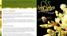
Web designs, such as many of those displayed on CSS Zen Garden use the interplay of positive and negative space to create depth to a design, which compels the eye to move around the page.
* Digital Web - Principle of Design
* Web Design Office - Negative Space
* Apogee Photo Magazine - Primer on positive and negative space
* Jim Saw's Design Notes
Looking deeper we realise that negative and positive spaces can develop an interdependence. Enough negative space (aka whitespace) around an object can draw attention to that object and give it priority.
A good composition is generally thought to have a balance of negative and positive space (although this can vary according to purpose). Artists like M. C. Escher play with reversal of negative and positive spaces to create complex illusions (Jirousek, C. Form, Shape and Space).
Web designs, such as many of those displayed on CSS Zen Garden use the interplay of positive and negative space to create depth to a design, which compels the eye to move around the page.
* Digital Web - Principle of Design
* Web Design Office - Negative Space
* Apogee Photo Magazine - Primer on positive and negative space
* Jim Saw's Design Notes
15 October 2007
NED12 Visual hierarchy
The arrangement of elements according to importance and emphasis.
* Lynch and Horton's Web Style Guide - Visual Hierarchy
* Luke Wroblewski - Visible Narratives: Understanding visual organisation
* Tutorial Outpost - Get Some hierarchy in Your Design
* Lynch and Horton's Web Style Guide - Visual Hierarchy
* Luke Wroblewski - Visible Narratives: Understanding visual organisation
* Tutorial Outpost - Get Some hierarchy in Your Design
NED12 Flowcharting and wireframes
Smashing Magazine
* 30 Usability Issues to be Aware of
* Designing with a Grid Approach
Digital Web Magazine
* Prototyping with Style
* Just Build It: HTML Prototyping and Agile Development
* Getting IA Done
* Return on Design (review of Ani Phyo's book)
A List Apart
* Avoid Edge Cases by Designing Up Front
* Paper Prototyping
Site Point
* Breaking Out of the Box
* Process and Documentation
.net Magazine
* Designing with Patterns
List of resources from WebsiteTips.com
* 30 Usability Issues to be Aware of
* Designing with a Grid Approach
Digital Web Magazine
* Prototyping with Style
* Just Build It: HTML Prototyping and Agile Development
* Getting IA Done
* Return on Design (review of Ani Phyo's book)
A List Apart
* Avoid Edge Cases by Designing Up Front
* Paper Prototyping
Site Point
* Breaking Out of the Box
* Process and Documentation
.net Magazine
* Designing with Patterns
List of resources from WebsiteTips.com
NED12 Rhythm and flow
Rhythm is a pattern created by repeating or varying elements, with consideration given to the space between them, to create an effective ebb and flow which visually leads the eye from one element to another.
From WikiBooks:
From WikiBooks:
..human beings are more comfortable with variation in general. Psychologically, most any serious lack in variation of anything (a solid, a line, a sound, a situation) can become very boring. Adding a little variation at non-specific intervals (every now and again) gives most any design an interesting appeal as long as it is not overdone.
If rhythm is overdone it can be disruptive and create a counter-dynamic.
13 October 2007
Texting, Facebook Used to Alert Students
Trying to make up my mind whether this is a cool adoption by educators of modern technology, or a sad indictment on the gun situation in the US - students are being alerted to the presence of armed and dangerous on campus via text, email and facebook adverts. Read more.
Agents losing student dollar to web
Interesting piece by Milanda Rout from AustralianIT, the increasing role of social networking sites like Facebook and Myspace in recruiting overseas students to universities. Read more.
9 October 2007
NED12 Stripey backgrounds in Photoshop
I had a lot of fun with my first NED12 assignment, and in the course of working on it greatly improved my knowledge and confidence in Photoshop. This photo by Georgie Sharp of a bee hovering over the wattle really took my fancy, and the stylised text above it is intended to be reminiscent of the bee's flight path. The stripey background was a simple technique I learned about from blogger Amy on Shooting the Kids.
More reading: Elements of great Web design: The polish

More reading: Elements of great Web design: The polish
Subscribe to:
Posts (Atom)