The arrangement of elements according to importance and emphasis.
* Lynch and Horton's Web Style Guide - Visual Hierarchy
* Luke Wroblewski - Visible Narratives: Understanding visual organisation
* Tutorial Outpost - Get Some hierarchy in Your Design
15 October 2007

NED12 Flowcharting and wireframes
Smashing Magazine
* 30 Usability Issues to be Aware of
* Designing with a Grid Approach
Digital Web Magazine
* Prototyping with Style
* Just Build It: HTML Prototyping and Agile Development
* Getting IA Done
* Return on Design (review of Ani Phyo's book)
A List Apart
* Avoid Edge Cases by Designing Up Front
* Paper Prototyping
Site Point
* Breaking Out of the Box
* Process and Documentation
.net Magazine
* Designing with Patterns
List of resources from WebsiteTips.com
* 30 Usability Issues to be Aware of
* Designing with a Grid Approach
Digital Web Magazine
* Prototyping with Style
* Just Build It: HTML Prototyping and Agile Development
* Getting IA Done
* Return on Design (review of Ani Phyo's book)
A List Apart
* Avoid Edge Cases by Designing Up Front
* Paper Prototyping
Site Point
* Breaking Out of the Box
* Process and Documentation
.net Magazine
* Designing with Patterns
List of resources from WebsiteTips.com
NED12 Rhythm and flow
Rhythm is a pattern created by repeating or varying elements, with consideration given to the space between them, to create an effective ebb and flow which visually leads the eye from one element to another.
From WikiBooks:
From WikiBooks:
..human beings are more comfortable with variation in general. Psychologically, most any serious lack in variation of anything (a solid, a line, a sound, a situation) can become very boring. Adding a little variation at non-specific intervals (every now and again) gives most any design an interesting appeal as long as it is not overdone.
If rhythm is overdone it can be disruptive and create a counter-dynamic.
13 October 2007
Texting, Facebook Used to Alert Students
Trying to make up my mind whether this is a cool adoption by educators of modern technology, or a sad indictment on the gun situation in the US - students are being alerted to the presence of armed and dangerous on campus via text, email and facebook adverts. Read more.
Agents losing student dollar to web
Interesting piece by Milanda Rout from AustralianIT, the increasing role of social networking sites like Facebook and Myspace in recruiting overseas students to universities. Read more.
9 October 2007
NED12 Stripey backgrounds in Photoshop
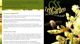
I had a lot of fun with my first NED12 assignment, and in the course of working on it greatly improved my knowledge and confidence in Photoshop. This photo by Georgie Sharp of a bee hovering over the wattle really took my fancy, and the stylised text above it is intended to be reminiscent of the bee's flight path. The stripey background was a simple technique I learned about from blogger Amy on Shooting the Kids.
More reading: Elements of great Web design: The polish

More reading: Elements of great Web design: The polish
7 October 2007
NED12 Texture
"Texture is created by varying the pattern of light and dark areas on an object." Elements of Design: Contrast from Bonnie Skaalid, 1999.
Five Texture Tips from Photoshop Tips & Tricks
Five Texture Tips from Photoshop Tips & Tricks
3 October 2007
NED12 Contrast
Something I've picked up from my reading about contrast - that it is not just about colour, but can be contrast in size, style or other aspects of objects.
As I was doing the NED12 exercise of selecting example web sites of high and low contrast, I was looking specifically at colour. The writer at Webreference.com reckons "this sort of contrast is too straightforward and even boring to be useful."
All Graphic Design has listed some other great resources about contrast.
Some simple examples of how contrasting elements are used for web page design to make it stand out and show what is important - Basic Web Page Layout & Design, University of Albany Libraries (2002)
As I was doing the NED12 exercise of selecting example web sites of high and low contrast, I was looking specifically at colour. The writer at Webreference.com reckons "this sort of contrast is too straightforward and even boring to be useful."
All Graphic Design has listed some other great resources about contrast.
Some simple examples of how contrasting elements are used for web page design to make it stand out and show what is important - Basic Web Page Layout & Design, University of Albany Libraries (2002)
1 October 2007
Rising cost of higher education in Australia
An article from The Age highlights the recent OECD report, which states that Australia has the fourth most expensive degrees in the developed world after the US, Japan and Korea.
There was hope on the horizon some months ago with opposition leader Kevin Rudd's pledge to do "something" about the massive debt shouldered by students; but policy details are lacking and it appears the issue is on the political backburner.
Increasing costs and reduced government funding do not yet appear to have deterred students, and the proportion of university students from disadvantaged socio-economic backgrounds remains steady - but there is argument that the actual effects will take some time to make themselves known.
"University participation direct from school is dropping, particularly among country students, who say they are deferring because of the cost." (Adam Morton, The Age)
1. HECS-HELP for eligible Commonwealth supported students;
2. FEE-HELP for eligible full-fee paying students; and
3. OS-HELP for eligible Commonwealth supported students who want to study overseas.
There was hope on the horizon some months ago with opposition leader Kevin Rudd's pledge to do "something" about the massive debt shouldered by students; but policy details are lacking and it appears the issue is on the political backburner.
Increasing costs and reduced government funding do not yet appear to have deterred students, and the proportion of university students from disadvantaged socio-economic backgrounds remains steady - but there is argument that the actual effects will take some time to make themselves known.
"University participation direct from school is dropping, particularly among country students, who say they are deferring because of the cost." (Adam Morton, The Age)
Govt schemes in last 30+ yearsThere are presently three types of university debt HELP schemes:
1974 Gough Whitlam abolishes university tuition fees, arguing higher education is a public good that should be free for all.
1989 John Dawkins, education minister in the Hawke government, introduces the Higher Education Contribution Scheme — a deferred loan system with fees drawn from wages once income passes $22,000. Original flat-fee rate of $1800 a year. The most expensive degree, medicine, costs $10,800.
1997 Howard Government introduces differential HECS. Students pay between $3300 and $5500, depending on their degree. Income threshold lifted from $25,000 to $35,000. Medicine costs $33,000.
1998 Introduction of full-fee places for Australian students.
2005 HECS rates lifted by 25 per cent. Maximum rate of $8018 a year. Medicine costs about $50,000.
2007 Cap lifted on how many full-fee places universities can offer. Full-fee degrees cost up to $250,000.
1. HECS-HELP for eligible Commonwealth supported students;
2. FEE-HELP for eligible full-fee paying students; and
3. OS-HELP for eligible Commonwealth supported students who want to study overseas.
More info www.goingtouni.gov.au.
25 September 2007
NED12 A design process revealed
A fellow student Tracy found this article by Douglas Bowman, A Design Process Revealed, very relevant to our first assessment task. It relates the processes behind designing a CSS Zen Garden submission. It is heartening to be told that no great artistic talent is necessary; design is a systematic process which can be grouped into phases as follows:
* research and discovery
* competitive analysis
* exploration
* thumbnail sketching
* typography
* imagery
* composition
* execution and implementation
* review
* research and discovery
* competitive analysis
* exploration
* thumbnail sketching
* typography
* imagery
* composition
* execution and implementation
* review
24 September 2007
NED12 Photoshop exercises
The "practice" exercises in Module 2 are driving me crazy! it is not that they are simple, or boring and repetitive; it is the vague and confusing wording of the task descriptions. I'm not alone in this, several of the other students have been having difficulty interpreting what is required from the task.
A lot of us are still learning to use Photoshop, some good links shared on the forum - del.icio.us/hamjak/photoshop. Thank goodness design is more than learning Photoshop.
Update 29/09 - Kathleen found a really good resource in Janee's Photoshop Tutorials. I am working my way through them and find them easy to follow, with good exercises to help remember things like shortcut keys etc. I have always been so confused by layers and paths, this set of lessons is making it a lot clearer.
A lot of us are still learning to use Photoshop, some good links shared on the forum - del.icio.us/hamjak/photoshop. Thank goodness design is more than learning Photoshop.
Update 29/09 - Kathleen found a really good resource in Janee's Photoshop Tutorials. I am working my way through them and find them easy to follow, with good exercises to help remember things like shortcut keys etc. I have always been so confused by layers and paths, this set of lessons is making it a lot clearer.
18 September 2007
No more paid content NY Times
Since starting at Uni my research efforts have been thwarted a few times by subscription-only content on the Web. Amongst the various publications, NY Times articles have appeared in search results looking very interesting and relevant, but would only take me as far as a login page.
So it is rather good news that NY Times have decided to do away with online subscriptions. This follows a review of their business model which showed that the potential ad revenue generated by traffic from search engines was greater than the revenue from paid subscriptions.
Read all about it on NY Times - Times to End Charges on Web Site
So it is rather good news that NY Times have decided to do away with online subscriptions. This follows a review of their business model which showed that the potential ad revenue generated by traffic from search engines was greater than the revenue from paid subscriptions.
Read all about it on NY Times - Times to End Charges on Web Site
16 September 2007
NED12 Visual weight
Visual weight an illusion of physical weight, such as with bold face type.
Balance where visual weight appears to be equally dispersed throughout the design.
- Symmetrical balance: mirrored distribution on either side of an imaginary vertical access
- Asymetrical balance: the arrangement of unequally weighted elements in a design.
Further reading:
* Visible Narratives: Understanding Visual Organization by Luke Wroblewski
* Composition and Design Principles by Marvin Bartel
* The Principles of Design by Joshua David McClurg-Genevese
Balance where visual weight appears to be equally dispersed throughout the design.
- Symmetrical balance: mirrored distribution on either side of an imaginary vertical access
- Asymetrical balance: the arrangement of unequally weighted elements in a design.
Further reading:
* Visible Narratives: Understanding Visual Organization by Luke Wroblewski
* Composition and Design Principles by Marvin Bartel
* The Principles of Design by Joshua David McClurg-Genevese
15 September 2007
NED12 Designing a unified interface
Another important element of design - unity. Coherence, usability, better communication. Psychological studies have shown that users want to see unity, if they don't see this they lose interest.
Unified design needs a consistent visual style throughout the document/site. Visual devices include visual style, alignment, balance, flow, and a grid.
Creating unity with visual style:
* Use similar colors
* Use similar shapes
* Use similar line weights
* Use similar typography
* Use similar photographs
* Use similar illustration styles
* Use same artist for all graphics
* Repeat the elements above you use throughout your site
Further reading:
Some examples of unified design through repetition, proximity, continuation.
Unity - Basic principles of design, from About.com
Unified design needs a consistent visual style throughout the document/site. Visual devices include visual style, alignment, balance, flow, and a grid.
Creating unity with visual style:
* Use similar colors
* Use similar shapes
* Use similar line weights
* Use similar typography
* Use similar photographs
* Use similar illustration styles
* Use same artist for all graphics
* Repeat the elements above you use throughout your site
Further reading:
Some examples of unified design through repetition, proximity, continuation.
Unity - Basic principles of design, from About.com
Subscribe to:
Posts (Atom)